Thursday, December 28, 2006

Artifacts


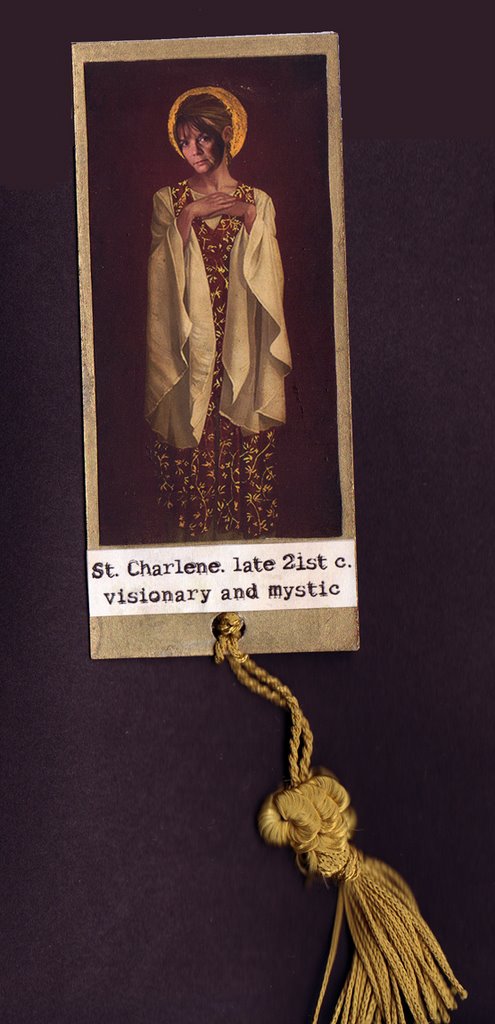
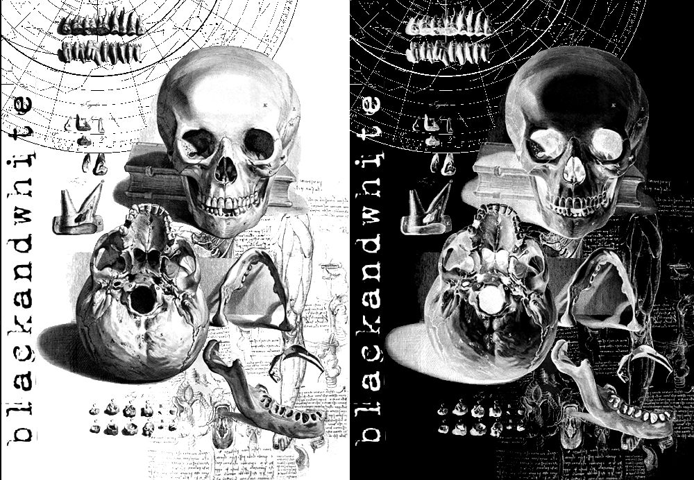
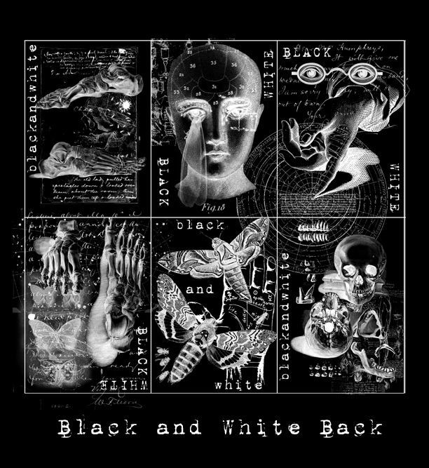
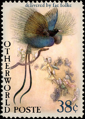
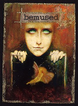
This is a Paper Traders project hosted by my sister Cheryl.

From her description:
Tip in pages must be 5 by 5.5 inches. Please create two pages (Like a spread in a journal) in increments of 4. For example, you may decide you'd like 12 pages to complete your book, so submit 24 tip in pages, 2 for each participant who receives your work. These 2 page spreads can be all the same or each one different.... "Artifacts": think ancient, mysterious, maybe indecipherable, maybe a found precious object...

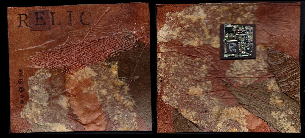
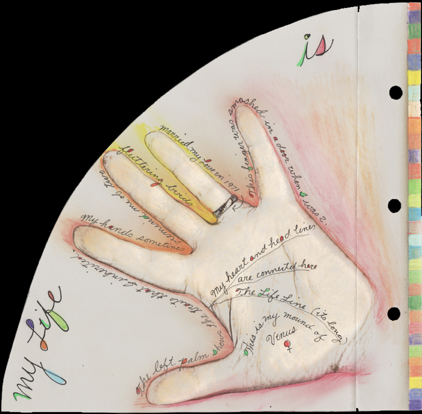
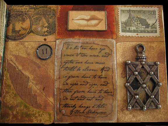
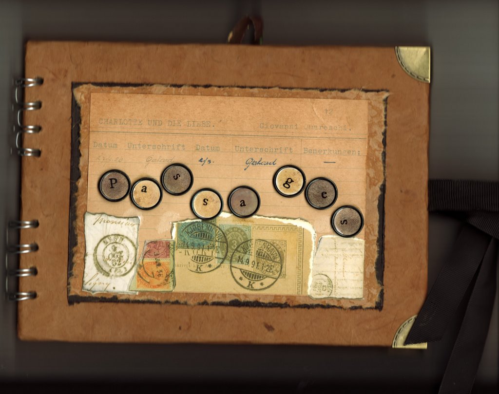
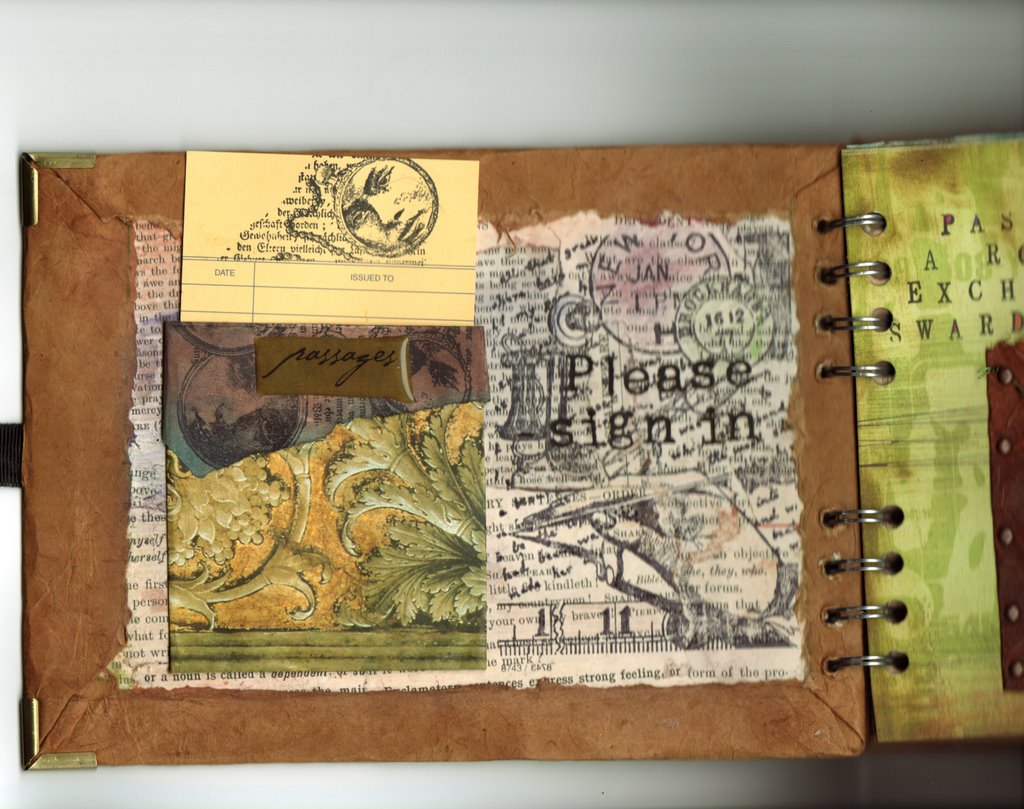
I used bits of circuit boards as "relics" as a concept. I started by painting Bristol board paper with raw umber acrylic mixed with a glaze medium. Then I patted plastic wrap over it to create texture. When that was dry I added texture with different kinds of paper, rice paper, tissue, and such. I also tore up a very old 1963 newspaper article sent to me by a Paper Trader friend, that was about about the very beginning of computer dating...a couple who met with the help of an IBM machine. I stained, distressed and reworked the dried pieces. Then with a 5x5.5 window, I chose the most interesting compositions. (Something I learned from my years cropping photos, a good crop can make an ordinary photo a great photo. ;-) ) Then I added the bit of circuit board mounted on a painted chipboard, finished with a bit of rubber stamping and Bam! LOL!

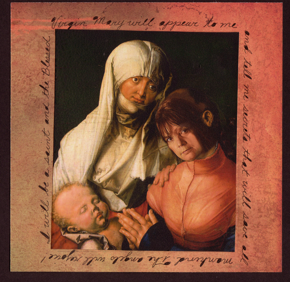
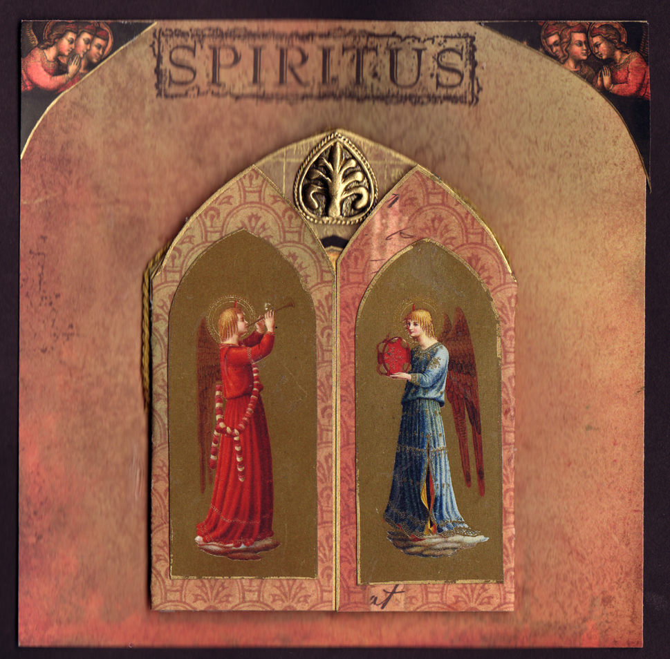
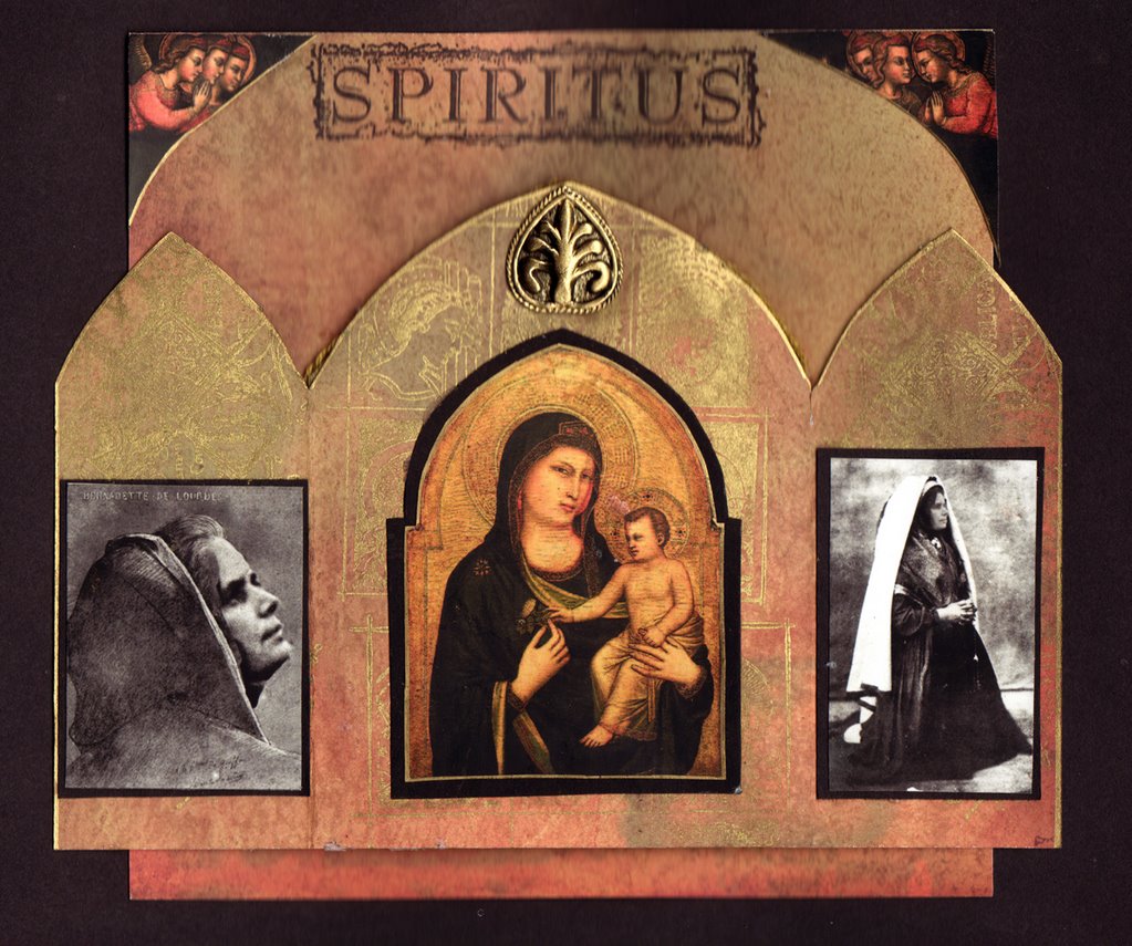
Here are more of them.

Saturday, December 23, 2006

Happy Holidays to All!


This time of year is so frenzied I don't think I'll be posting for a while. Just wanted to say Happy Holidays to everyone! May your days be merry and bright! xoxoxo
Charlene

Saturday, December 09, 2006

Saint Me

Okay, another spread for my family's traveling art journal project. This one is for my sister Suze's, "What will you be in your next life?"

My response is that "I will be a saint and the Virgin Mary will appear to me and tell me secrets that will save all mankind. And the angels will rejoice."

I know, "whacked!" LOL!

I morphed my face into a Madonna and child painting with Photoshop. I guess that would be Madonna, Madonna's Mother Ann, and child.


The left side is a shrine that opens up. The angels are rejoicing. Spiritus is a rubber stamp.
It has a little brass embellishment. Ahhhhh...you can almost smell the frankincense. :-)

Can you tell I was raised Catholic? 12 years of Catholic school, 4 years of Latin, and many years of catechism instruction. Tantum ergo sacramentum...tu tu oh.


Here is the open shrine. The "saint" is me morphed into photos of Bernadette of Lourdes. I actually DID want to become a saint as a child. I spent many summer nights searching the skies for apparitions. Alas and Alack...She stood me up. Ha! I also knelt on the pews in the Church on the Ladies side waiting for the statue to cry, or give milk, ore something! (...churches are divided betweeen the Mary side and Joseph side. )

A holy card...inserted into the book.

Sunday, December 03, 2006

Lost in Wonderland


This is a spread in my neice Rachel's travelling journal. Her theme is "In a Faraway Land." I used the same Lewis Carol quote from my Nonsense piece from a previous post. I used two cardboard ornaments of Alice and the White Rabbit. The clock is made from a rubber stamp , gold embossing powder, a brad to hold the hands in place, and mounted on chipboard.
The background is a Basic Grey paper. I like the way the flow of the text mimics the wave of pink behind it. You can't really do justice to a spread like this with a scan. It looks flat and dull. Maybe I'll ask my husband to photograph it tomorrow.

Here's a detail of the rubber stamping. I used colored pencils and chalk pencils to color them in. Theres a lot of gold paint dotting the pattern. It creates a great texture. I think I'm going to work with this techniques some more. I love the tapestry look.

Thursday, November 30, 2006

Nonsense


"If I had a world of my own, everything would be nonsense. Nothing would be what it is, because everything would be what it isn't. And contrary wise, what is, it wouldn't be. And what it wouldn't be, it would. You see?"
from Alice in Wonderland

This is a digital graphic I created for a Paper Traders project Calendar Project. The border will probably end up being one square of the checkerboard, not two. There's an allowance for the full bleed. I was inspired by looking at some victorian 3d cards. I wanted to create that feel. Next time I'll really exagerate the effect so that it looks like a pop-up card. There's always next time.

A friend once said that's in the artistic temperament...that stretching and reaching. It may just be obsessional. I'm not sure.

I had fun with "flip horizontal".

Sunday, November 26, 2006

Kat Soto's web site


I've been working furiously all week to get this new website finished. The client, Kat Soto, adorned the windows at Shreve & Co. in San Francisco with her mannequins and the unveiling was the day after Thanksgiving. So the site had a strict deadline. I'm really happy with it, and so is Kat. She said it's like looking through a View Master. :-)
I created a set of backgrounds using William Morris patterns, layering them over each other, playing with the transparency and deconstructing them. The objects, trims, tools, and such are actually Kat's equipment. My husband took a bunch of photos and I painstakingly erased the background out.
Some of the objects on the page above were created from nothing...purely digital...like the board complete with screws, and the hang tags. All done in Photoshop.
Take a look...and view the galleries. Her work is incredible!
KatSoto.com

Thursday, November 16, 2006

paper cuts


My cousin Mary Ellen sent me a few images of some incredible art. Check out the work of this exceptional papercut artist! His name is Peter Callesen. I love the way he uses both the negative and positive shapes. And his 3d folded paper is intrinsically tethered to the cut-out shape. Almost a tragic feel to it. I wonder if its cut with a laser?

Here's his cut paper work.
Here's his home page.

Tuesday, November 14, 2006

Snow Angel

This is one of a dozen cards I made for a Paper Traders ATC swap. The description of the swap was "Ornaments can be any shape as long as they remain within ATC dimensions, are decorated front & back including a small signature and incorporate a hanging device of some kind.". The hostess is Gisele of Jersey UK.
I kind of stayed within the rules. The card itself is ATC size but the embellishments stick out a bit. Lets just say it definitelty WON'T fit inside the standard plastic sleeve. But it'll look great on a tree.
The found the image of the young girl on a disc I bought from Luna Girl. I added wings and painted the furry parts with irridescent medium. I glued on mica bits, snow glitter and opalescence flakes. Trimmed with birch twigs dipped in fake ice. Added a boingy wire to hang and shredded a very wide ribbon to create the fringe trim. It reminds me of an old tree top angel we had as children with hair of fiberglass strands.
On the back is a quite by Norman Vincent Peale: "Christmas waves a magic wand over this world, and behold, everything is softer and more beautiful."

I have six left from this series if anyone wants to trade a christmas ornament, one for one. Let me know. I'd love to start a collection of paper ornaments. :)

Monday, November 06, 2006

black and white


These are a set of digital ATC's I made a while back for a swap themed "black and white".
I created all six at once on a template for ATC's that looks like this:

You can download it if you want. Here's a large version (8.5 x 11 x 200 dpi). I filled each rectangle with its own composition of images, some overlap onto more than one card. I found the images on a Google image search. They're old scientific drawings.
I then hit the "invert" command in Photoshop and created the same image but...well, inverted.


Then I printed each page on heavy weight glossy paper and cut each card out, mounted it on black cardstock, glued its inverted partner onto the back of the card and ended up with 6 cards of both black and white images. Next time I'll print them out with a laser printer though. I looked at them after a few months and they are starting to fade. Live and learn.

Saturday, November 04, 2006

My Life is in my Hands


A spread for a RR in Cynthia's Art Journal called Arc of Life. Its shaped like a fan. I scanned my hands, eliminated the background, used a PS filter (rough pastels), and sketched in colors with chalk pencils and ink.

Friday, November 03, 2006

Gluttony

This is a spread in my neice Hannah's Round Robin Art Journal
called Sin and Virtues. I chose "gluttony" as my preferred sin...
these days anyway. :-)


Its straight up collage work. I started with a Basic Grey background paper.
Added torn and cut paper elements.
Some writing and scrawling.
eat,eat,eat,eat,eat
Eat everything on your plate and you can have dessert.
There are children starving in China
If you're good you'll have some pie.

And this little piggie cried all the way home boo hoo.
Inside the box is a big X.

Thursday, October 26, 2006

Photoshop Tutorial - Winging It


This lesson is about how to add wings to things. Its not too hard. The trick is finding the right wings for the right image. Here, grab a net, I'll get you going on a butterfly hunt:
wings, wings and more wings

Here's the tutorial.

Saturday, October 21, 2006

...and thereby hangs a tale.


This is a spread for a travelling art journal in the Paper Traders group. The theme was "something old". I chose a passage from As You Like It:
'Tis but an hour ago since it was nine,
And after one hour more 'twill be eleven;
And so, from hour to hour, we ripe and ripe,
And then, from hour to hour, we rot and rot;
And thereby hangs a tale.'

The background paper that I started with looked like stone tiles. After much ado about how to arrange a composition around the blocked areas I decided to go with it instead of fight it. So I treated each block as a separate area and created a "sampler" of techniques, objects and images. The Shakespearean text is layered between two thin slices of mica like a sandwich.

Friday, September 29, 2006

haute couture


This is a journal entry for a Round Robin exchange. Its in my daughters book. Her theme is France. I picked up on the colors that she had started with. The text is printed on transparent film on my ink jet printer.


I found fashion images in a google search, converted them to b&w and tinted the RED using the handtinting technique from a previous tutorial posted here.


I inserted a card with an embossed rubber stamp image black on white on one side, white on black on the other.


I stapled and glued fabric swatches, tattered tulle, a rose petal and some trims to liven it up a bit. Voila!

Thursday, September 28, 2006

Photoshop Tutorial - Faux Postage

Create your own set of postage stamps, your own post office in an imaginary realm, heck why not create your own kingdom? This tutorial should be pretty easy to follow. Try to find an image of an old stamp and a new image that are approximately the same size. You can scan images of an old stamp and new graphic also. They don't have to be an exact match but you can't have one image be HUGE like 300 dpi and one small like 72 dpi.

Don't read this if math makes you nuts: Most of the images you find on the internet are 72 dpi. That translates to 1 inch on the monitor. So an image that is 3" x 4" x 72 dpi looks like 3"x 4" on your screen. An image that is 3" x 4" x 300 dpi gets stetched out on the screen to 12" x 16".

On to the tutorial, click here.

Saturday, September 23, 2006

Photoshop Tutorial - Faux Hand Tinting

This tutorial is how to take a black and white vintage photo and give it the look of hand tinting using Photoshop. This should also work with Photoshop Elements. There's nothing fancy about it. And its good for beginners. The tutorial is very explicit.
You can also take a modern b&w photo, reduce the contrast a bit, and when your done add noise and distress it a bit. Maybe I'll do another tutorial on that down the road.

The tutorial is graphic intensive, give it time to load.

If you have any questions, and if you enjoy these tutorials and would like me to continue with them please comment. Sometimes I feel like I'm talking to myself. Hey, maybe I am. :)

Oh yeah, click here for the tutorial.

Tuesday, September 19, 2006

At the Crossing


I'm finally getting some extra creative energy to work on my Faery Crossing site. This was the first site I ever created, I think it was back in 1988. Its been my playground ...a place where I can explore new ideas and techniques with abandon. There's a large audience, it gets 10,000 hits a month, but they are all pretty anonymous, so I feel very safe putting myself out there in a creative way.
This is the menu page. Its a montage of this and that... I used a painting by Grimshaw as the background. Its in the public domain I believe, painted over a hundred years ago. I found a photo of the gypsy wagon online and incorporated it on the road, a signpost from Russia....other snips and bits. Funny how my digital art is looking more and more like paper collage.

Sunday, September 10, 2006

That horrible morning


five years ago we woke up to unbearable incredible news. Images of horror, shock, confusion, chaos, helplessness and despair. A new age has dawned where fear and hatred dictate our lifestyles. Will we ever recover? Can innocence ever be recaptured once it is wrenched away by force?
Anyway..here is the response my husband and I created five years ago, shortly after the events of 9-11. Its been visited by millions and I've received emails about it from people all over the globe.
Click here to view. (click the "Imagine" link once you get there.)

Wednesday, September 06, 2006

Passages

This is the cover of "Passages", a traveling art journal project. There are five of us Sward sisters and 6 of our daughters participating. We are a family of artists.

The theme I chose, Passages, will be filled with favorite literary passages. I bought a used book in German a while ago and out fell a very old library card. I used it for the cover.

This is the artists sign in page. The background is a collage of torn pages from an old English Primer. I used chalk pencils for color...rubber stamps for texture. A Library card for the artists signatures. But you can see that. :-)


The instructions page.

Richard Brautigan

Richard Brautigan

I love to read his poems
they sit in my lap like flopping minnows
waiting to be hooked and devoured.

But its his prose I am after for this book.
The minnows will have to flop.

In Watermelon Sugar

I thought the hand drawn words would compliment Brautigan's style. If I were to do it again I'd leave out the watermelon seeds. No one needs to be hit on the head with ideas. It feels like a cliche. But it was the last element I used so it had to stay. I carved the seed shape from the eraser end of a pencil and used it as a stamp and then I drew around them a bit with pen. All that work to find out it was superfluous.

Yes Yes

Left side of the "yes" spread. The Molly Bloom soliloquy is a passage that I've loved since my college days. James Joyce's style was so familiar to me...maybe because its the way I think. ::chuckle:: This is the last paragraph in the last chapter of Ulysses, sometimes called Penelope. It consists of thousands of words in a long stream of consciousness that builds in intensity resulting in the Molly Bloom soliloquy and ends with the only punctuation mark in the entire chapter which is a final period and said to represent yes the female orgasm. :-)

Yes

O and the sea the sea crimson sometimes like fire and the glorious sunsets and the figtrees in the Alameda gardens yes and all the queer little streets and pink and blue and yellow houses and the rosegardens and the jessamine and geraniums and cactuses and Gibraltar as a girl where I was a Flower of the mountain yes when I put the rose in my hair like the Andalusian girls used or shall I wear a red yes and how he kissed me under the Moorish wall and I thought well as well him as another and then I asked him with my eyes to ask again yes and then he asked me would I yes to say yes my mountain flower and first I put my arms around him yes and drew him down Jo me so he could feel my breasts all perfume yes and his heart was going like mad and yes I said yes I will Yes.

Friday, August 25, 2006

Paper Traders Home Page Art


Paper Traders is a yahoo group for Artists Trading Cards. What are ATC's? Click here to find out. We take turns creating Home Page Art for our group. They have to be ATC size (2.5 x 3.5) These are all digital. Some of these graphics contain my ATC's in the image, which I think is very fun.


Friday, August 11, 2006

Alice woke me up

So, it turns out that the doldrums I was experiencing were further complicated by some health issues. I'm slowly getting myself up to snuff.
I had to pull myself together to meet a client's deadline and put this section of her website together. The theme was Alice and the art dolls that she is selling are exquisite. I had fun with it. Take a peek!

Tuesday, July 18, 2006

the doldrums


Maybe its the summer heat, but I'm passing through a dry spell lately. Can't seem to get my creative juices flowing. I guess I'll just ride it out and wait for the winds to fill my sails again. When I was younger I called these times "le grand ennui". :-)

Some things I've done while riding it out:


  • organized my ephemora into baggies with labels
  • cleaned my brushes
  • filled some hostess bags for ACT swaps
  • played with rubber stamps
  • made lists of what I should be doing

Friday, July 14, 2006

Max's Photos


My son the rock star ....photographer. :-)
These are photos that my son Max took of some friends playing music. Max is also a musician and has some interesting friends. He's living in Eugene Oregon, going to school and pursuing graphic art and photography.
Click here to see the photos.